Comic book creator Darwyn Cooke died last week at the too-young age of 53. Cancer. Friends of his in and out of the industry are mourning his death, talking about what a good person he was: enthusiastic about his work, generous with his time, friendly to fans, making comics for the right reasons.
I can't talk about that because I never met him. I just loved his work. So I'll talk about that.
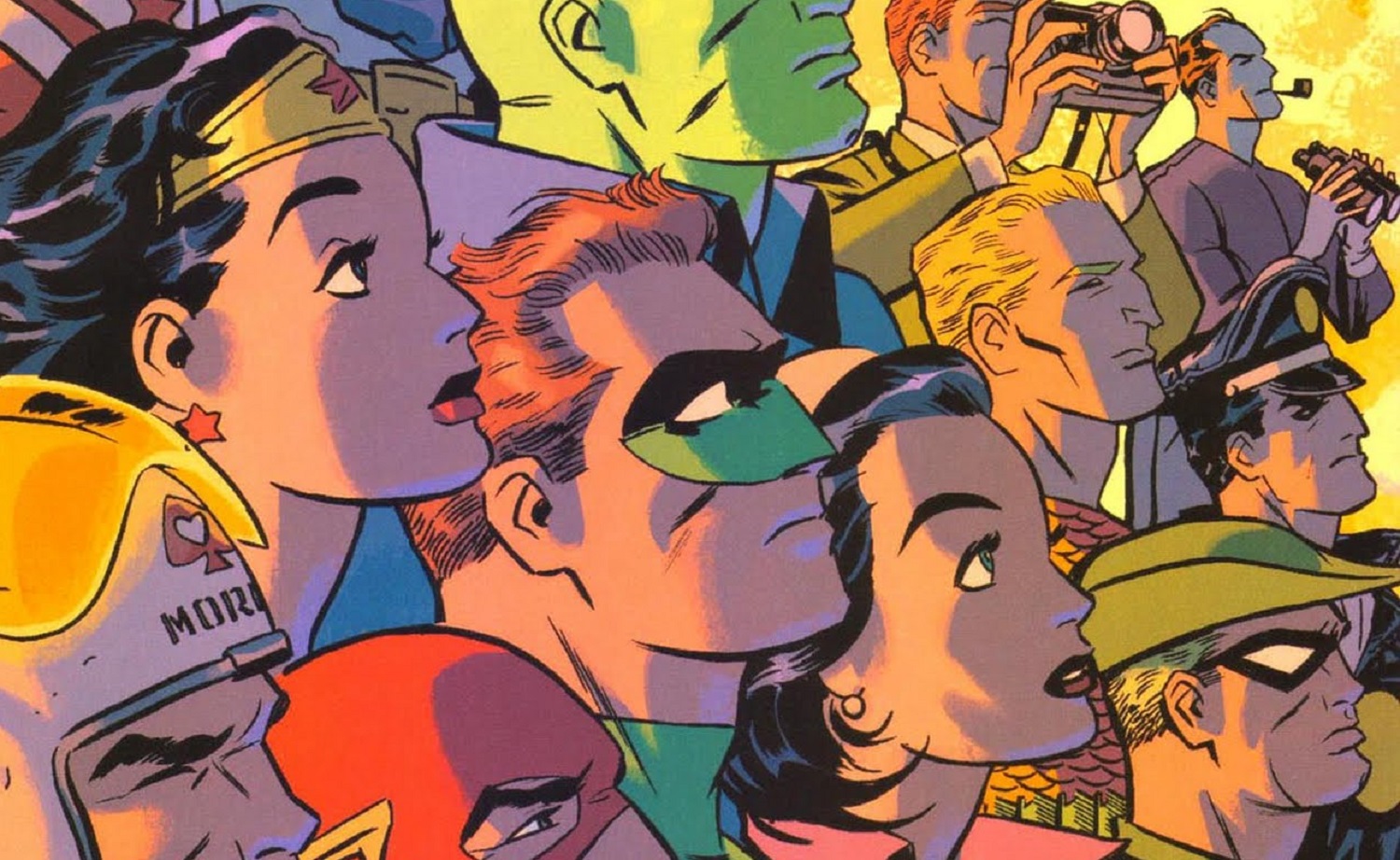
 |
| There are a hundred stories in the city, and Cooke tells all of 'em in one drawing. |
Understand that everything below this sentence is my opinion based on a lifetime reading, studying and creating comics. This is what I see when I look at Cooke's work. If you see something else, that's good too.
Cooke came to comics from animation, and it shows. Animation is all about economy: draw nothing but the lines you absolutely must, because you'll be drawing them another 10,000 times. Character designs are often based on simple geometric shapes that are easy to turn in space as the character moves. Clean lines, solid blacks. Not a lot of fussing around.
 |
| A tradition of animation excellence echoed in Cooke's art: Superman by the Fleischer brothers, Space Ghost model sheet by Alex Toth, Jonny Quest model sheet by Doug Wildey. The Fleischer Superman cartoon shorts are particularly beautiful examples that influenced generations of creators including Cooke and me, as in my "Last Mechanical Monster" webcomic. |
Cooke built on his animation roots and transcended them. His style is often called "retro," and I'm sure some of that was due to Cooke looking back at the Old Masters of the 1940s and '50s, liking what he saw, and incorporating some of their look and feel. But I'll bet a lot of it involved Cooke facing the same storytelling problems they did and arriving at similar solutions on his own. Because while Cooke does evoke the past, nobody in any decade drew like he did.
Illustrators vs. Essentialists
There are two approaches to cartooning I'll call the Illustrators and the Essentialists. Scott McCloud probably has other names for them but that's how I think of them. Those aren't the only two approaches--there are others that could be called Abstract, Impressionism, Photorealism, etc., roughly corresponding to the same schools in fine art--but they're the two that I think illuminate Cooke's unique talent.
Illustrators have a long pedigree, coming out of the tradition of book illustration that predated comic strips and comic books. It's tempting to call it a "realistic" style, but there's nothing really realistic about it. It's romantic, heroic, detailed, dynamic. Classical. This is the kind of art most people think of when they think "comic books." It's also the type of art that anyone can look at and think, "Wow, that's good drawing!"
 |
| Some comics artists in the Illustrator tradition: (upper left) Alex Raymond, "Flash Gordon"; (upper right) Hal Foster, "Prince Valiant"; (lower left) John Buscema, "The Avengers"; (lower right) Neal Adams, "Batman." |
The artists I'm calling Essentialists take a different approach. The idea is that comics shouldn't necessarily try to mimic reality but instead embrace their built-in comic-ness. The ideal comic is one that distills reality to its essence, omitting anything that doesn't matter. Simplify, polish, pare. This approach is common among some types of comics--Charlie Brown's face is a masterpiece of minimalism--but unusual in superhero comics.
 |
| Two dots, a half circle and a squiggly line are all Charles Schulz needed to create a character who could break your heart. |
Cooke stood out because he was an Essentialist in an industry filled with Illustrators. Here's an example. On the left, Batman by Neal Adams; on the right, Batman by Darwyn Cooke. Adams drew hundreds of lines defining the contours and expression of Batman's face. Cooke drew two, plus two white triangles for eyes. You couldn't draw much less than that, yet it's still instantly recognizable as Batman.
 |
| Compare how the artists handled the shading on Batman's forehead. Adams's is all elaborate cross-hatching and feathering, while Cooke's is a simple swath of black. |
I'm not criticizing Adams! He's one of the all-time greats. They were different artists pulling from different traditions to different ends. But the graphic clarity and immediate punch of Cooke's style is very strong and appealing.
One reason Cooke's work struck me as powerfully as it did is because I'm an Essentialist, too. Whenever I redraw something, it's always to take out lines, never to add them. My perfect comic would be a single line that conveys exactly the information or emotion I intend.
It takes a lot of hard work to make it look easy.
Which isn't to say that Cooke's drawings were simple. Not at all. They were often filled with action and detail, but they were always clear and uncluttered. Cooke's gracefully balanced compositions guided the reader's eye where he wanted it to go. Not a line was wasted.
 |
| The first thing you see is Robin, throwing the grenade whose smoke trail leads back to him via the flow of his cape. Then you follow the line of Robin's outstretched arm directly to Batman, and continue to Batman's hands clenching the steering wheel. Maybe later you notice the chaos of cars speeding and tumbling through the background. |
 |
| That highway sign at upper right breaks this drawing's symmetry and makes it a lot more interesting. It also provides exposition: even if the reader doesn't recognize the George Washington Bridge on sight, an elaborate suspension bridge combined with the name "Hudson" (as in "River") hints at where the character's going: New York City. |
 |
| (EDITED TO ADD: This is irrelevant but kind of cool: out of curiosity, I looked up this location in Google Street View and found the sign. How about that!) |
Inkiness
The panel immediately above, from Cooke's adaptation of Richard Stark's Parker novels, shows one way in which Cooke outgrew his animation foundation: brushwork. I don't know enough about Cooke's methods to know if he used actual brushes to put ink on paper, or electronic styluses to put pixels on monitors, but it hardly matters. The controlled looseness of his ink line (or virtual ink line?) wouldn't work for animation but fits right into one of comics' oldest and finest traditions.


 |
| Masterful brushwork by Milton Caniff (top), Will Eisner (center) and Mort Meskin (bottom). |


The casual confidence required to command line, form, light and shadow with such apparent ease astonishes me. Bringing a line to life is one of the hardest artistic feats there is. I feel like I pull it off maybe one out of every thirty or forty tries. Cooke managed to do it every time.
Proportions
Cooke also did a subtle thing that humanized his characters and separated him from the pack: he (mostly) drew them in realistic proportions.
Since the ancient Greeks, artists have known that if you want to make someone look really heroic, give them a disproportionately small head (or, if you prefer, a disproportionately large body). Most real-life adults are about 7½ heads tall; most superheroes are at least 8 heads tall. Sometimes 9 or 10 or more.
 |
| Christopher Reeve stood about 7½ heads tall, while the drawing of his counterpart on the right is more than 8 heads tall. Compare and contrast not just their muscles, but their other proportions (shoulders-to-waist, leg length-to-torso, etc.) as well. Tricks of the trade. |
 |
| This ancient Greek statue of the god Apollo has about the same proportions as the Superman drawing above. |
 |
| This Hulk is so incredibly powerful that his fists are twice as large as his puny head! And those feet! Yikes! |
Heroic proportions can get pretty ridiculous once you start noticing them. For the most part, Cooke reined his in. This created an interesting paradox: despite how abstract and stylized he drew his characters, they often looked more real than characters drawn in a more detailed illustrative style.
 |
| Wonder Woman and Batman, in atypically realistic proportions. |
Cooke's men have barrel chests but aren't muscle-bound. His women have broad shoulders and credible waists. His characters are thick and powerful. They have weight. To me they suggest circus performers in costumes--which were Siegel and Shuster's inspiration when they created Superman.
Color
Again, I don't know enough about Cooke's working method to say how his art was colored. I don't want to give him too much or too little credit. Coloring isn't usually done by the artist, but there's enough unity in all his work--especially Parker--that I'm confident he at least had a very strong hand in directing it.
I think Cooke's use of color is his secret weapon. It gives form to figures and features that could otherwise appear two-dimensional and dull. Look at that Wonder Woman drawing immediately above left. She's lit by blue light from the left and pink light from the right ("chiaroscuro") that makes her pop off the page. Cooke's characters are dressed in bold primary and secondary colors, as they should be, but there's always a haze or shadow to mute them. Backgrounds are subdued. His artwork feels light and bright but never garish.
 |
| A painting by Cooke for New Frontier. |
Cooke's colors reminds me (and perhaps only me) of the work of the mid-century master Mary Blair, most famous for her work as a concept artist for Disney. They shared a thoughtful use of lighting to give life and form to fairly flat, almost geometrical, shapes. In any case, color is a key reason Cooke's work is instantly recognizable as his and no one else's.
 |
| Mary Blair studies for Disney's "Peter Pan" and "Cinderella." |
Fun
Virtually every summary of Cooke's work uses that word, exemplified by both his art and his writing. Not that the stories he told were always light and funny. Parker was a hard-boiled noir detective, and Cooke's New Frontier version of the Justice League took some dark and serious turns.
Yet everything he did had a stylistic lightness and liveliness that never let his tales tip into grim, gory, or depressing. When appropriate for the story, nobody ever had more fun being a superhero than Cooke's characters.
 |
| Just as I posted this, I noticed the orange mass of Batgirl's hair. Surrounded by the high contrast of her black cape, it pulls the reader's eye right to her face. And it still reads as "hair" even though there's not a single line drawn on it. Terrific. |

 |
| Again, look at the use of color. |
No need to take my word for Cooke's attitude toward storytelling when we have his. At a WonderCon panel in 2015, Cooke spoke on the state of today's superhero comic book business:
I can’t really read superhero comics anymore because they’re not about superheroes. They’ve become so dark and violent and sexualized. I think it’s a real wrong turn. I don’t know how a company like Warner Bros. or Disney is able to rationalize characters raping and murdering and taking drugs and swearing and carrying on the way they do, and those same characters are on sheet sets for 5-year-olds, and pajamas and cartoons . . .
I think the bravest and smartest thing one of these companies could do would be to scrap everything they’re doing and bring in creative people who would have the talent and were willing to put in the effort it takes to write an all-ages universe that an adult or a child could enjoy. If either one of these companies were smart enough to do that, I think they could take huge strides for the industry.
Cooke was a great talent, maybe even a necessary one. I'm sorry we lost him but I'm glad we had him at all.
6 comments:
Thanks for the article. The things you explained were very obvious once you pointed them out. Many of the Cooke drawings you used as examples do look like animation cels.
I just discovered your blog. I loved The New Frontier, and Cooke's work on it was one of the big reasons. I'm sorry to hear he passed. I love his style.
I've also just picked up a copy of What Ever Happened to the World of Tomorrow? A friend of mine and I were talking recently about the Montreal Expo 67 and how it may have been the last great World Exposition. So, I've been thinking a lot lately about mid-20th century optimism and it's loss. I very much enjoyed your particular take on the subject.
You're welcome, Hank. You're right about the cel look of Cooke's superhero art. You can almost see the light coming through them.
Randy, thanks for reading my book! I agree about Expo 67; it's the last one I remember having a real cultural impact, and it's hard to imagine huge numbers of people getting excited about anything similar in the future.
Disney’s Epcot is like a permanent World’s Fair. I don’t think there is any way that one could have the kind of impact that the 1939 NY World’s Fair, the 1893 Chicago one with the huge Ferris Wheel, or the Philadelphia Centennial Exposition of 1876 (and several others) had.
For one thing, people were a lot more optimistic about the future. Today, people seem to thing that everything is going to hell, despite conquering many diseases, a higher average standard of living, more civil rights for minorities, and hand-held computers that also make telephone calls (even if we don’t have our flying cars!). I’ll have to find and re-read my copy of “Whatever Happened to the World of Tomorrow?” to see what else we are missing.
Brian, I keep going back to that picture of Christopher Reeve and the Superman drawing. I think Reeve was the best looking live-action Superman ever (best uniform too), yet compared to the drawing, he looks kind of puny and almost fat! What do you figure the drawn Superman’s waist size is in that drawing?
Thanks a lot for your comments, Hank. I appreciate you reading Whatever Happened to the World of Tomorrow, too!
Chris Reeve did bulk up for the role but he was no bodybuilder--not that it would have changed his proportions much. Reeve was great and the gold standard, but I actually like Henry Cavill's look as Superman very much. I just don't like much about the stories his writers and producers put him in. No idea how a comic book Superman's measurements would scale up into reality. It'd probably turn out something like trying to make a living Barbie doll--a nightmare!
Thanks again.
Post a Comment